Adverity Rebrand
Evolving the brand identity of a data-driven marketing solution to keep pace with an ever-changing market and stand out from the competition.

CLIENT
Adverity Technologies Ltd
YEAR
2023
ROLE
In-house, Senior Designer
SERVICE
Brand Identity
01 - OVERVIEW
Making data look as smart as it is.
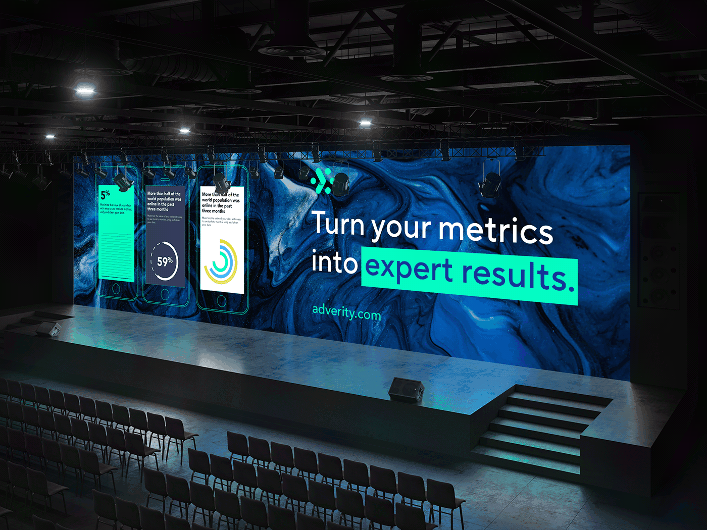
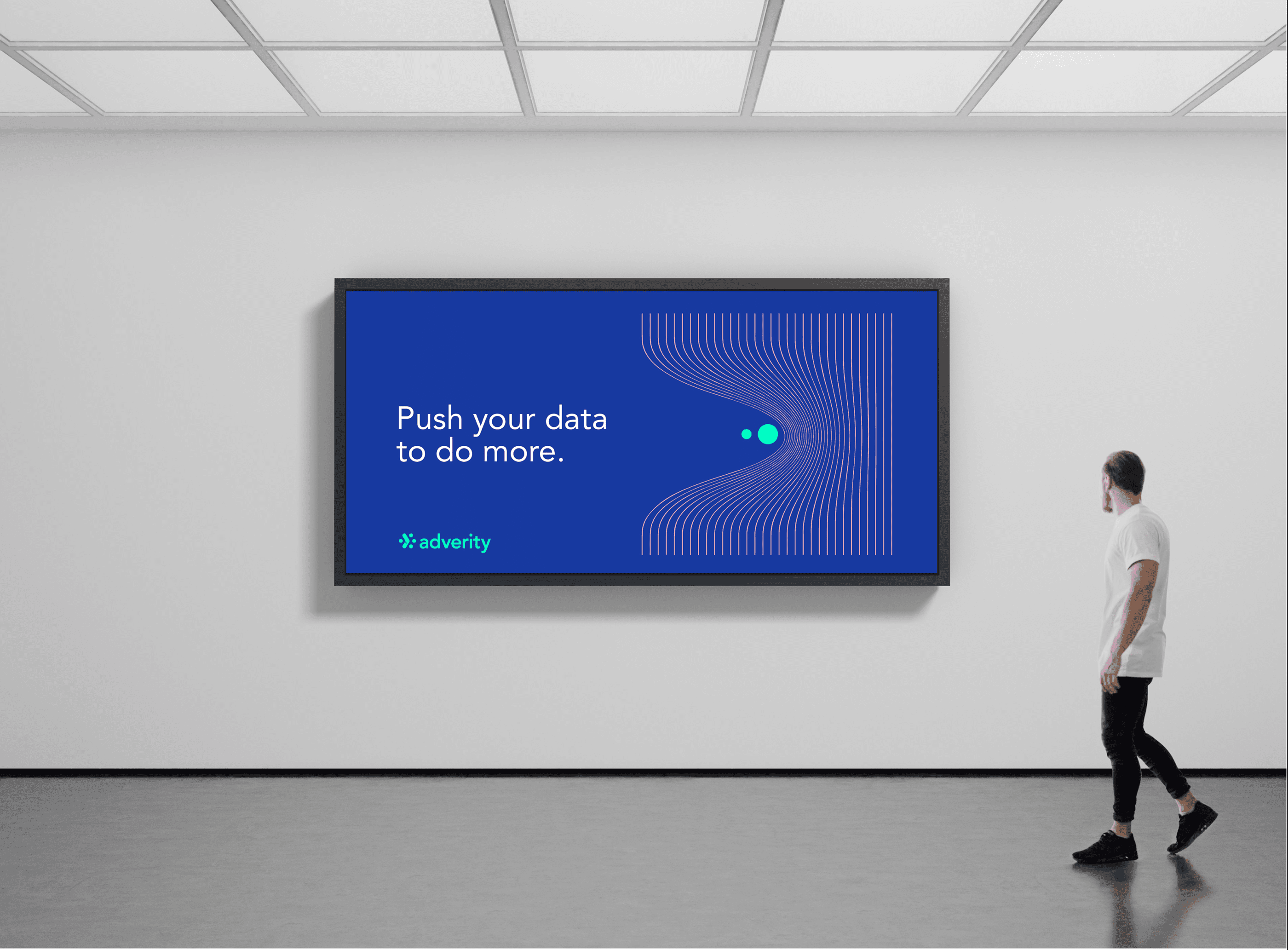
Adverity is a marketing data platform that helps businesses make sense of their data and get more out of their marketing. Founded in 2015, they've grown into a serious player in the Martech space and their brand identity has been left behind. The goal was to produce an identity that felt as confident and polished as the product itself, while still resonating with their global audience.


“A brand that finally looked as sharp as the product behind it.”
ADVERITY'S MARKETING TEAM
02 - PROCESS
From a simple hexagon to a room full of people.
The starting point was their existing hexagon logo, a core element of Adverity's identity. Rather than replacing it, we evolved it. From there, we built out a full visual system: , a bold new colour palette, clean typography, and a set of bespoke illustrations that add a bit of personality without taking things too seriously. The new direction was deliberately more playful and people-focused. Illustrations centred on human figures, built from simple geometric shapes, with dots woven throughout as a subtle nod to Adverity's data roots. The result is a brand that feels grown-up, but still has some fun with it.

03 - CREDIT
A little shoutout to the people involved.
CMO
Harriet Durnford-Smith
BRAND & DESIGN MANAGER
Jennifer Stephens
UX SUPPORT
Eugen Lapshin
WEB DEVELOPER
Sarah Gargett
NEXT PROJECT
The Science Behind Aroma Care Solutions
VIEW PROJECT